自定义可展开收起的TextView

接到需求,需要在RecyclerView的item中对提示信息做展开收起的操作。提示文案以三行为限,小于等于三行,不显示按钮;大于三行,显示按钮并可展开。不懂?好吧看图:


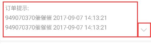
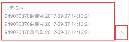
如图,我把提示文案拼接成一个字符串做展示,左边文案是一个TextView,右边按钮是一个ImageView。

在attrs.xml 加上如下代码:

1
2
3
4
5
6
7
8
<declare-styleable name="ExpandableTextView">
<!-- 默认折叠状态下,文字最多显示的行数 -->
<attr name="maxCollapsedLines" format="integer"/>
<!-- 将文字展开的图标(向下的箭头) -->
<attr name="expandDrawable" format="reference"/>
<!-- 将文字收起的图标(向上的箭头) -->
<attr name="collapseDrawable" format="reference"/>
</declare-styleable>

创建自定义MyExpandabaleTextView

1
2
3
4
5
6
7
8
9
10
11
12
13
14
15
16
17
18
19
20
21
22
23
24
25
26
27
28
29
30
31
32
33
34
35
36
37
38
39
40
41
42
43
44
45
46
47
48
49
50
51
52
53
54
55
56
57
58
59
60
61
62
63
64
65
66
67
68
69
70
71
72
73
74
75
76
77
78
79
80
81
82
83
84
85
86
87
88
89
90
91
92
93
94
95
96
97
98
99
100
101
102
103
104
105
106
107
108
109
110
111
112
113
114
115
116
117
118
119
120
121
122
123
124
125
126
127
128
129
130
131
132
133
134
135
136
137
138
139
140
141
142
143
144
145
146
147
148
149
150
151
152
153
154
155
156
157
158
159
160
161
162
163
164
165
166
167
168
169
170
171
172
public class MyExpandabaleTextView extends LinearLayout implements View.OnClickListener {
// 默认行数
private static final int MAX_COLLAPSED_LINES = 3;
// 显示内容的TextView
protected TextView mTv;
// 箭头按钮ImageView
protected ImageView mIvButton;
// 是否需要重新布局。当调用了setText()方法后,该值置为true
private boolean mRelayout;
// 默认TextView处于收起状态
private boolean mCollapsed = true;
// 收起状态下的最大显示行数
private int mMaxCollapsedLines;
// 箭头按钮的展开图标
private Drawable mExpandDrawable;
// 箭头按钮的收起图标
private Drawable mCollapseDrawable;
// 如果是在ListView中,需要使用到mCollapsedStatus和mPosition,保存当前position的展开或收起状态
private SparseBooleanArray mCollapsedStatus;
private int mPosition;
public MyExpandabaleTextView(Context context) {
super(context);
}
public MyExpandabaleTextView(Context context, AttributeSet attrs) {
super(context, attrs);
init(attrs);
}
@TargetApi(Build.VERSION_CODES.HONEYCOMB)
public MyExpandabaleTextView(Context context, AttributeSet attrs, int defStyle) {
super(context, attrs, defStyle);
init(attrs);
}
private void init(AttributeSet attrs) {
TypedArray typedArray = getContext().obtainStyledAttributes(attrs, R.styleable.ExpandableTextView);
mMaxCollapsedLines = typedArray.getInt(R.styleable.ExpandableTextView_maxCollapsedLines, MAX_COLLAPSED_LINES);
mExpandDrawable = typedArray.getDrawable(R.styleable.ExpandableTextView_expandDrawable);
mCollapseDrawable = typedArray.getDrawable(R.styleable.ExpandableTextView_collapseDrawable);
//按钮展开和收起的图标
if (mExpandDrawable == null) {
mExpandDrawable = getResources().getDrawable(R.mipmap.photo_down);
}
if (mCollapseDrawable == null) {
mCollapseDrawable = getResources().getDrawable( R.mipmap.photo_up);
}
typedArray.recycle();
// 默认不显示
setVisibility(GONE);
}
@Override
protected void onMeasure(int widthMeasureSpec, int heightMeasureSpec) {
// 如果没有改变显示内容,或者显示内容为空,执行super.onMeasure()并返回
if (!mRelayout || getVisibility() == View.GONE) {
super.onMeasure(widthMeasureSpec, heightMeasureSpec);
return;
}
mRelayout = false;
// 先隐藏箭头按钮,将文字最大显示行数设置到最大,后面再根据测量情况修改
mIvButton.setVisibility(GONE);
mTv.setMaxLines(Integer.MAX_VALUE);
// 测量
super.onMeasure(widthMeasureSpec, heightMeasureSpec);
// 如果内容未超出限定的最大显示行数,直接返回。在这种情况下,无需展开和收起。
if (mTv.getLineCount() <= mMaxCollapsedLines) {
return;
}
// 限定TextView的最大行数,并将箭头按钮显示出来
if (mCollapsed) {
mTv.setMaxLines(mMaxCollapsedLines);
}
mIvButton.setVisibility(VISIBLE);
// 再次重新测量
super.onMeasure(widthMeasureSpec, heightMeasureSpec);
}
@Override
public void onClick(View view) {
// 文字内容太短,无需折叠时,箭头按钮是隐藏的。这时直接返回。
if (mIvButton.getVisibility() != View.VISIBLE) {
return;
}
// 将变量mCollapsed和mButton显示的图片赋值为相反
mCollapsed = !mCollapsed;
//根据TextView处于的状态判断文字和图片的展示
if (mCollapsed){
mIvButton.setImageDrawable(mExpandDrawable);
}else{
mIvButton.setImageDrawable(mCollapseDrawable);
}
// 将当前位置的状态保存起来,在ListView中需要使用
if (mCollapsedStatus != null) {
mCollapsedStatus.put(mPosition, mCollapsed);
}
if (mCollapsed) {
// 收起
mTv.setMaxLines(mMaxCollapsedLines);
} else {
// 展开
mTv.setMaxLines(mTv.getLineCount());
}
}
// 设置显示内容
public void setText(@Nullable CharSequence text) {
mRelayout = true;
mTv.setText(text);
// 内容不为空时,才会显示
setVisibility(TextUtils.isEmpty(text) ? View.GONE : View.VISIBLE);
}
// 设置显示内容,在ListView等存在item复用的情况下需要使用该方法
public void setText(@Nullable CharSequence text, @NonNull SparseBooleanArray collapsedStatus, int position) {
mCollapsedStatus = collapsedStatus;
mPosition = position;
boolean isCollapsed = collapsedStatus.get(position, true);
clearAnimation();
mCollapsed = isCollapsed;
if (mCollapsed){
mIvButton.setImageDrawable(mExpandDrawable);
}else{
mIvButton.setImageDrawable(mCollapseDrawable);
}
setText(text);
getLayoutParams().height = ViewGroup.LayoutParams.WRAP_CONTENT;
requestLayout();
}
@Override
protected void onFinishInflate() {
super.onFinishInflate();
findViews();
}
private void findViews() {
mTv = (TextView) findViewById(R.id.expandable_text);
mTv.setOnClickListener(this);
mIvButton = (ImageView) findViewById(R.id.expand_collapse);
if (mCollapsed){
mIvButton.setImageDrawable(mExpandDrawable);
}else{
mIvButton.setImageDrawable(mCollapseDrawable);
}
mIvButton.setOnClickListener(this);
}
}

布局文件

1
2
3
4
5
6
7
8
9
10
11
12
13
14
15
16
17
18
19
20
21
22
23
24
25
26
27
28
29
30
31
32
33
34
35
36
<?xml version="1.0" encoding="utf-8"?>
<com.ddky.newsender.view.MyExpandabaleTextView
xmlns:android="http://schemas.android.com/apk/res/android"
android:id="@+id/expand_text_view"
android:layout_width="match_parent"
android:layout_height="wrap_content"
android:orientation="horizontal">
<TextView
android:id="@+id/expandable_text"
android:layout_width="0dp"
android:layout_height="wrap_content"
android:layout_weight="1"
android:paddingLeft="11dp"
android:paddingRight="10dp"
android:lineSpacingExtra="6dp"
android:textColor="@color/color_999999"
android:textSize="@dimen/text_size_13"/>
<!--<TextView-->
<!--android:id="@+id/expand_collapse"-->
<!--android:layout_width="wrap_content"-->
<!--android:layout_height="wrap_content"-->
<!--android:drawablePadding="5dp"-->
<!--android:background="@android:color/transparent"-->
<!--android:layout_gravity="bottom"-->
<!--android:paddingRight="10dp"-->
<!--android:paddingTop="10dp"/>-->
<ImageView
android:id="@+id/expand_collapse"
android:layout_width="wrap_content"
android:layout_height="wrap_content"
android:layout_gravity="bottom"
android:paddingRight="10dp"
android:paddingTop="12dp"/>
</com.ddky.newsender.view.MyExpandabaleTextView>

可以看出我们需要的是一个orientation=”horizontal”的横向布局,如果需要纵向布局把orientation改成orientation=”vertical”,那么需要展示的文案和展开收起的button就会纵向显示。

在需要调用的地方:itemViewHolder.expandableView.setText(“订单提示:吧啦吧啦。。。”);就可以完美展示上述效果了。

如果展开收起的是文字那么可以用TextView,把mIvButton改成mTvButton;如果文字搭配图片作为按钮的话,可以如下设置:

1
2
3
4
5
6
7
8
9
if (mCollapsed){
mExpandDrawable.setBounds(0, 0, mExpandDrawable.getMinimumWidth(), mExpandDrawable.getMinimumHeight());
mTvButton.setCompoundDrawables(null, null, mExpandDrawable, null);
mTvButton.setText("展开");
}else{
mCollapseDrawable.setBounds(0, 0, mCollapseDrawable.getMinimumWidth(), mCollapseDrawable.getMinimumHeight());
mTvButton.setCompoundDrawables(null, null, mCollapseDrawable, null);
mTvButton.setText("收起");
}

监听和动画效果

监听和动画效果,后期会逐渐完善

如需转载,请注明出处:YauLam’s Blog,thank u~